 From Spiral05 To Spiral06
The code for the Model Concepts project is at model_concepts on GitHub.
The code for the Magic Boxes project is at mb_spirals on GitHub. For teaching or learning purposes, each spiral in Magic Boxes is decomposed into several sub-spirals.
In Spiral 05, there is a tool bar that provides a new way of creating, selecting and moving boxes. In Spiral 06, a menu bar provides four buttons to select all boxes, to delete selected boxes, to hide selected boxes and to show hidden boxes. A line tool in the tool bar, allows a line creation between the last two clicked boxes.
A simple menu bar provides two buttons to create 6 boxes and to delete all boxes (Figure 05-06.01).
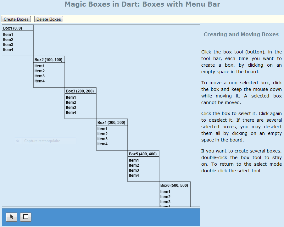
Figure 05-06.01: Simple menu bar.
The new MenuBar class has two button attributes of the ButtonElement type. The class has also the board attribute, to have access to methods of the Board class.
Code 05-06.01: The MenuBar class.
class MenuBar {

  final Board board;

  ButtonElement createBoxesButton;
  ButtonElement deleteBoxesButton;

  MenuBar(this.board) {
    createBoxesButton = document.querySelector('#create-boxes');
    deleteBoxesButton = document.querySelector('#delete-boxes');

    // Menu bar events.
    createBoxesButton.onClick.listen((MouseEvent e) {
      board.createBoxes(6);
    });

    deleteBoxesButton.onClick.listen((MouseEvent e) {
      board.deleteBoxes();
    });
  }

}
In the constructor of the MenuBar class the two button elements are found in the document by using the querySelector method and element ids. The buttons are linked to click events in order to create 6 boxes by the first button and to delete all boxes by the second button.
Code 05-06.02: Create and delete boxes.
void createBoxes(int n) {
    int x = 0; int y = 0;
    for (int i = 0; i < n; i++) {
      boxes.add(new Box(this, x, y, Box.DEFAULT_WIDTH, Box.DEFAULT_HEIGHT));
      x = x + Box.DEFAULT_WIDTH;
      y = y + Box.DEFAULT_HEIGHT;
    }
  }

  void deleteBoxes() {
    boxes.clear();
  }
The for loop in the createBoxes method is initialized with the i variable of the int type. The loop is terminated when the value of the i variable becomes n. With each iteration the i variable is incremented by 1.
The menu bar is represented in the mb.html file by the nav element of HTML5, which defines a section of navigation links.
Code 05-06.03: The navigation section.
<nav id="menu" class="menu">
      <button id="create-boxes">Create Boxes</button>
      <button id="delete-boxes">Delete Boxes</button>
    </nav>
The presentation of the nav element is determined by the CSS class called menu. This user defined class is a CSS selector placed in the menu.css file, located in the css sub-folder of the project. The class name is prefixed with a dot. This name does not have to be unique, as an identifier name, within a page.
Code 05-06.04: The menu class of CSS.
.menu {
    margin: 0px;
    padding: 0px 0px 0px 0px;
    background: #fffff0;
  }
The menu bar is an attribute of the Board class. It is created in the constructor of the Board class.
Code 05-06.05: The menu bar attribute.
class Board {
  …
  MenuBar menuBar;
  …
  Board(CanvasElement canvas) {
    …
    menuBar = new MenuBar(this);
The MenuBar class is updated to have four buttons to select all boxes, to delete selected boxes, to hide selected boxes and to show hidden boxes (Figure 05-06.02).
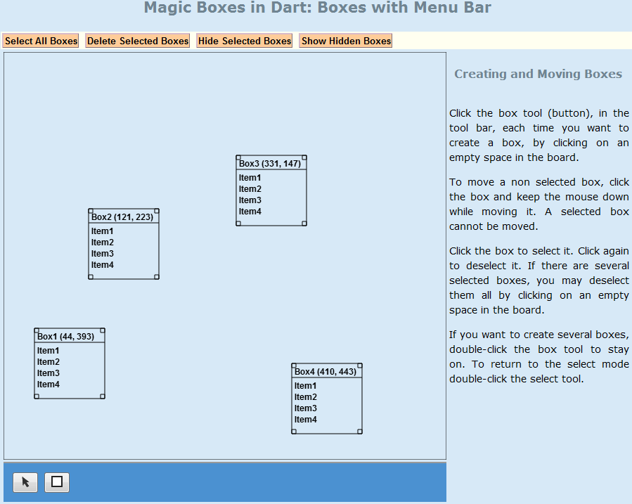
Figure 05-06.02: Menu bar.
The MenuBar class is completely changed to contain the four new buttons of the ButtonElement type. In the constructor of the class, the four buttons are obtained by the query method, and click events are linked to the buttons. A click on a button, triggers a corresponding action (a method of the Board class).
Code 05-06.06: The menu bar with four buttons.
class MenuBar {

  final Board board;

  ButtonElement selectBoxesButton;
  ButtonElement deleteSelectedBoxesButton;
  ButtonElement hideSelectedBoxesButton;
  ButtonElement showHiddenBoxesButton;

  MenuBar(this.board) {
    selectBoxesButton = document.querySelector('#select-boxes');
    deleteSelectedBoxesButton = document.querySelector('#delete-selected-boxes');
    hideSelectedBoxesButton = document.querySelector('#hide-selected-boxes');
    showHiddenBoxesButton = document.querySelector('#show-hidden-boxes');

    // Menu bar events.
    selectBoxesButton.onClick.listen((MouseEvent e) {
      board.selectBoxes();
    });

    deleteSelectedBoxesButton.onClick.listen((MouseEvent e) {
      board.deleteSelectedBoxes();
    });

    hideSelectedBoxesButton.onClick.listen((MouseEvent e) {
      board.hideSelectedBoxes();
    });

    showHiddenBoxesButton.onClick.listen((MouseEvent e) {
      board.showHiddenBoxes();
    });
  }

}
The selectBoxes method of the Board class is similar to the deselectBoxes method. As the deselectBoxes does not verify if a box is selected before it is deselected, the selectBoxes method does not check if a box is not selected before selecting it.
Code 05-06.07: The selectBoxes method of the Board class.
void selectBoxes() {
    for (Box box in boxes) {
      box.select();
    }
  }
In a for loop over a copy of the boxes attribute, if a box is selected it is removed from the boxes attribute. The box is removed by the remove method of the List type.
Code 05-06.08: The deleteSelectedMethod of the Board class.
void deleteSelectedBoxes() {
    var listCopy = boxes.toList();
    for (Box box in listCopy) {
      if (box.isSelected()) {
        boxes.remove(box);
      }
    }
  }
The hideSelectedBoxes and showHiddenBoxes of the Board class delegate the tasks to the Box class.
Code 05-06.09: To hide and show selected boxes.
void hideSelectedBoxes() {
    for (Box box in boxes) {
      if (box.isSelected()) {
        box.hide();
      }
    }
  }

  void showHiddenBoxes() {
    for (Box box in boxes) {
      if (box.isHidden()) {
        box.show();
      }
    }
  }
The private _hidden attribute is initialized to false. The hide method changes a value of the attribute to true, while the show method assigns false to the attribute. The isHidden method returns a boolean value of the private attribute.
Code 05-06.10: To hide and show a box.
class Box {
  …
  bool _hidden = false;

  hide() => _hidden = true;
  show() => _hidden = false;
  bool isHidden() => _hidden;
The draw method does its job only if a box is not hidden.
Code 05-06.11: The draw method of the Box.
void draw() {
    if (!isHidden()) {
      board.context.beginPath();
      …
      board.context.closePath();
      board.context.stroke();
    }
  }
The menu bar gets a new look with the help of the button selector in the link.css file.
Code 05-06.12: The class selector with the button name.
.button {
    padding: 1px;
    background: #ffcc99;
    border-right: 1px solid #999;
    border-bottom: 1px solid #999;
    border-style: outset;
    border-color: #d7b9c9;
    font-weight: bold;
    text-align: center;
  }
The four button elements are embedded within the nav element.
Code 05-06.13: The navigation section with the button class.
<nav id="menu" class="menu">
      <button id="select-boxes" class="button">
        Select All Boxes
      </button>
      <button id="delete-selected-boxes" class="button">
        Delete Selected Boxes
      </button>
      <button id="hide-selected-boxes" class="button">
        Hide Selected Boxes
      </button>
      <button id="show-hidden-boxes" class="button">
        Show Hidden Boxes
      </button>
    </nav>
A number of selected boxes is determined by the countSelectedBoxes method of the Board class.
Code 05-06.14: Counting selected boxes.
int countSelectedBoxes() {
    int count = 0;
    for (Box box in boxes) {
      if (box.isSelected()) {
        count++;
      }
    }
    return count;
  }
In addition to boxes, lines may be now created between boxes (Figure 05-06.03). A new line is created first by selecting the line tool in the tool bar, second by clicking on two different boxes, then by clicking on an empty space in the board. A line may also be created by clicking on two different boxes, then by selecting the line tool in the tool bar, and finally by clicking on an empty space in the board. The line tool may be double-clicked to keep it active in order to create more than one line. The select tool must be double-clicked to return to the select mode.
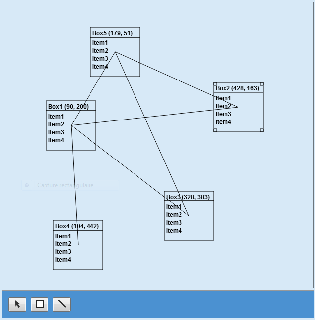
Figure 05-06.03: Boxes and lines.
The ToolBar class is updated to accommodate the LINE tool. A boolean private attribute _selectToolDblClicked replaced the _boxToolDblClicked attribute.
Code 05-06.15: Line button in the tool bar.
class ToolBar {
  …
  static const int LINE = 3;
  …
  bool _selectToolDblClicked = true;

  ToolBar(this.board) {
    …
    ButtonElement lineButton = document.querySelector('#line');

    // Tool bar events.
    …
    lineButton.onClick.listen((MouseEvent e) {
      _onTool = LINE;
    });
    lineButton.onDoubleClick.listen((MouseEvent e) {
      _onTool = LINE;
      _selectToolDblClicked = false;
    });
  }
The isLineToolOn method is added to the ToolBar class, and the selectToolOn method is updated.
Code 05-06.16: Two methods of the ToolBar class.
bool isLineToolOn() {
    if (_onTool == LINE) {
      return true;
    }
    return false;
  }

  void selectToolOn()  {
    if (_selectToolDblClicked) {
      _onTool = SELECT;
    }
  }
The Line class represents the line concept. It constructor accepts the board and two boxes as line ends. The line will be drawn between centers of the boxes. The moveTo method positions an imaginary pen to the center of the first box, while the lineTo method moves the pen to the center of the second box.
Code 05-06.17: The Line class.
class Line {

  final Board board;

  Box box1;
  Box box2;

  Line(this.board, this.box1, this.box2) {
    draw();
  }

  void draw() {
    board.context.beginPath();
    board.context.moveTo(box1.x + box1.width / 2, box1.y + box1.height / 2);
    board.context.lineTo(box2.x + box2.width / 2, box2.y + box2.height / 2);
    board.context.stroke();
    board.context.closePath();
  }

}
The lines attribute of the Board class is of the List type. The type is parameterized to accept only objects of the Line class.
Code 05-06.18: The lines attribute.
class Board {
  …
  List<Line> lines;

  Box beforeLastBoxClicked;
  Box lastBoxClicked;
  …
  Board(CanvasElement canvas) {
    …
    lines = new List();
There are also two box attributes that make references to two boxes that are last clicked on. Their values are determined in the onMouseDown method of the Box class.
Code 05-06.19: The last box clicked on.
void onMouseDown(MouseEvent e) {
    _mouseDown = true;
    if (board.toolBar.isSelectToolOn() && contains(e.offset.x, e.offset.y)) {
      toggleSelection();
    }
    if (contains(e.offset.x, e.offset.y)) {
      board.beforeLastBoxClicked = board.lastBoxClicked;
      board.lastBoxClicked = this;
    }
  }
The main work of managing events conditionally on the active tool of the tool bar is done in the onMouseDown method of the Board class. If a click does not hit an existing box, three different modes are handled: select, box and line. If the tool bar is in the line mode, a new line is constructed, but only if there are boxes (different from null) to be connected by the line. The null symbol represents a non-existence of an object. If a variable is not (!) null, it means that it references an existing object.
Code 05-06.20: Managing events based on the active tool.
void onMouseDown(MouseEvent e) {
    bool clickedOnBox = false;
    for (Box box in boxes) {
      if (box.contains(e.offset.x, e.offset.y)) {
        clickedOnBox = true;
        break;
      }
    }

    if (!clickedOnBox) {
      if (toolBar.isSelectToolOn()) {
        deselectBoxes();
      } else if (toolBar.isBoxToolOn()) {
        Box box = new Box(this, e.offset.x, e.offset.y,
          Box.DEFAULT_WIDTH, Box.DEFAULT_HEIGHT);
        if (e.offset.x + box.width > width) {
          box.x = width - box.width - 1;
        }
        if (e.offset.y + box.height > height) {
          box.y = height - box.height - 1;
        }
        boxes.add(box);
        toolBar.selectToolOn();
      } else if (toolBar.isLineToolOn()) {
        if (beforeLastBoxClicked != null && lastBoxClicked != null) {
          Line line = new Line(this, beforeLastBoxClicked,
            lastBoxClicked);
          lines.add(line);
        }
        toolBar.selectToolOn();
      }
    }
  }
The line button element is added to the footer of the main section of the page. The line.png image is located in the img folder of the application.
Code 05-06.21: The line button.
<section id="main">
      <canvas id="canvas" width="630" height="580">
        Canvas is not supported in your browser.
      </canvas>
      <footer>
        <button id="select"><img src="img/select.png"/></button>
        <button id="box"><img src="img/box.png"/></button>
        <button id="line"><img src="img/line.png"/></button>
      </footer>
      <script type="application/dart" src="mb.dart"></script>
      <script src="packages/browser/dart.js"></script>
    </section>
The tool buttons in the tool bar have a visual sign (Figure 05-06.04) which one is active (on). The active tool has a black border, while off buttons have a grey border.
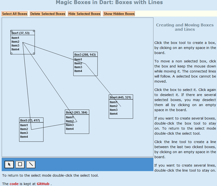
Figure 05-06.04: Active tool in the tool bar has a black border.
The ToolBar class has now the three buttons as attributes.
Code 05-06.22: The tool buttons as attributes.
class ToolBar {
  …
  int _onTool;
  bool _selectToolDblClicked;

  ButtonElement selectButton;
  ButtonElement boxButton;
  ButtonElement lineButton;
The button attributes are used in the new onTool method to change the color of button elements depending on the active tool.
Code 05-06.23: The active button changes its border color to black.
onTool(int tool) {
    _onTool = tool;
    if (_onTool == SELECT) {
      selectButton.style.borderColor = "#000000"; // black
      boxButton.style.borderColor = "#808080"; // grey
      lineButton.style.borderColor = "#808080"; // grey
    } else if (_onTool == BOX) {
      selectButton.style.borderColor = "#808080"; // grey
      boxButton.style.borderColor = "#000000"; // black
      lineButton.style.borderColor = "#808080"; // grey
    } else if (_onTool == LINE) {
      selectButton.style.borderColor = "#808080"; // grey
      boxButton.style.borderColor = "#808080"; // grey
      lineButton.style.borderColor = "#000000"; // black
    }
  }
The onTool method is called in the constructor of the ToolBar class. Note that the _onTool and _selectToolDblClicked private attributes are now initialized in the constructor.
Code 05-06.24: The use of the onTool method to put a tool on.
ToolBar(this.board) {
    selectButton = document.querySelector('#select');
    boxButton = document.querySelector('#box');
    lineButton = document.querySelector('#line');

    // Tool bar events.
    selectButton.onClick.listen((MouseEvent e) {
      onTool(SELECT);
    });
    selectButton.onDoubleClick.listen((MouseEvent e) {
      onTool(SELECT);
      _selectToolDblClicked = true;
    });

    boxButton.onClick.listen((MouseEvent e) {
      onTool(BOX);
    });
    boxButton.onDoubleClick.listen((MouseEvent e) {
      onTool(BOX);
      _selectToolDblClicked = false;
    });

    lineButton.onClick.listen((MouseEvent e) {
      onTool(LINE);
    });
    lineButton.onDoubleClick.listen((MouseEvent e) {
      onTool(LINE);
      _selectToolDblClicked = false;
    });

    onTool(SELECT);
    _selectToolDblClicked = true;
  }
The onTool method is also called in the selectToolOn method of the ToolBar class.
Code 05-06.25: The select tool becomes active.
void selectToolOn()  {
    if (_selectToolDblClicked) {
      onTool(SELECT);
    }
  }
In the right section of the page there is a new paragraph with two Web links.
Code 05-06.26: The two Web links.
<section id="right">
      <header>
        <h3>Creating and Moving Boxes and Lines</h3>
      </header>
        …
      <p>
        The
        <a href="https://github.com/dzenanr/model_concepts">
          code
        </a>
        is kept at
        <a href="https://github.com/">
          GitHub
        </a>.
      </p>
    </section>
The two links are styled with link selectors in the link.css file. A Web link may have four different states: unvisited, visited, active and hoover. These four links states are controlled by pseudo classes of CSS, which are used to add special effects to some selectors.
Code 05-06.27: The Web link CSS selectors.
a:link {
    text-decoration: none;
    font-weight: bold;
    color: #003366;
  }

  a:visited {
    text-decoration: none;
    font-weight: bold;
    color: #c50000;
  }

  a:hover {
    text-decoration: none;
    color: #ffffee;
    background: #336799;
  }

  a:active {
    text-decoration: none;
    color: #ff9911;
  }
The mb.html file uses a new style in the list.css file.
Code 05-06.28: The list style CSS link.
<head>
    <meta charset="utf-8"/>
    <meta name="author" content="Dzenan Ridjanovic"/>
    <title>mb</title>
    <link rel="stylesheet" href="css/layout.css"/>
    <link rel="stylesheet" href="css/layout2c.css"/>
    <link rel="stylesheet" href="css/link.css"/>
    <link rel="stylesheet" href="css/list.css"/>
    <link rel="stylesheet" href="css/menu.css"/>
    <link rel="stylesheet" href="css/page.css"/>
  </head>
The Web links use the link class to provide additional style.
Code 05-06.29: The link class.
<p>
        The
        <a href="https://github.com/dzenanr/model_concepts" class="link">
          code
        </a>
        is kept at
        <a href="https://github.com/" class="link">
          GitHub
        </a>.
      </p>
The link class is defined in the list.css file.
Code 05-06.30: The unordered list (ul) style.
ul {
    list-style: none;
    padding: 2px;
    text-align: left;
  }

  li {
    padding-top: 1px;
    padding-bottom: 1px;
    padding-left: 18px;
  }

  .link li {
    background: url(img/arrow-right.gif) no-repeat 0 50%;
    padding-top: 1px;
    padding-bottom: 1px;
    padding-left: 18px;
  }
Since the two Web links used in the HTML page are not put within the unordered list, this new style does not have any effect. In addition, the arrow-right.gif image cannot be found within the img folder. This is an example of what should not have been included in the current spiral. The spiral approach does not hide mistakes made. They may be corrected in one of future spirals.